Final Images
My photography project is based on the word ‘Globalisation’ and these are a set of photos to show the different way in which restaurants appeal to people. For my original idea was to look at the effects of big brands such as McDonald’s, Starbucks, KFC etc and show that even though they are all worldwide brands they fall victim to the increasing amount of litter around us. However, having thought about it I decided that it would be better to show the way in which global brands are portrait next to say takeaways or other styles of cuisine restaurants that are not from the USA.
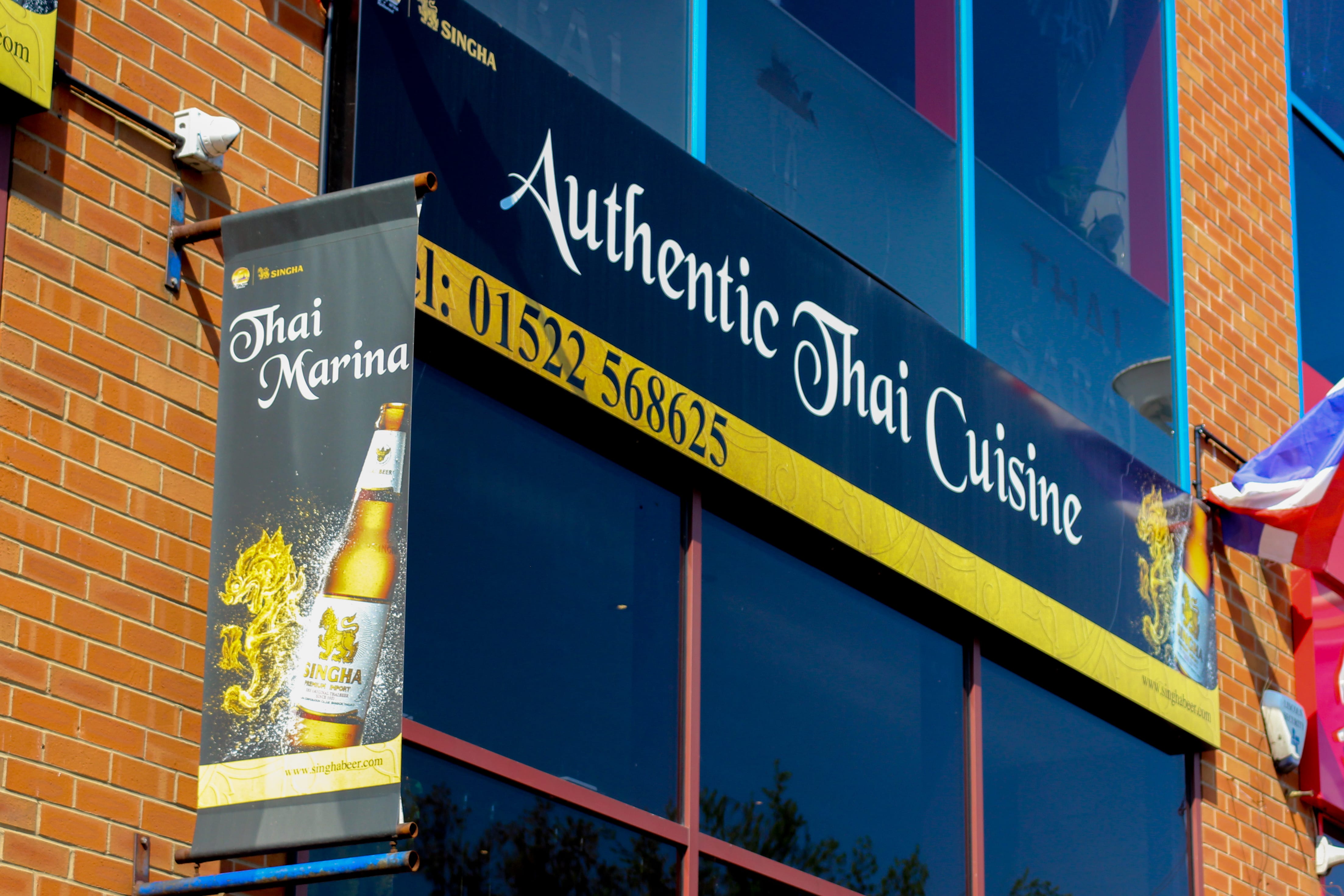
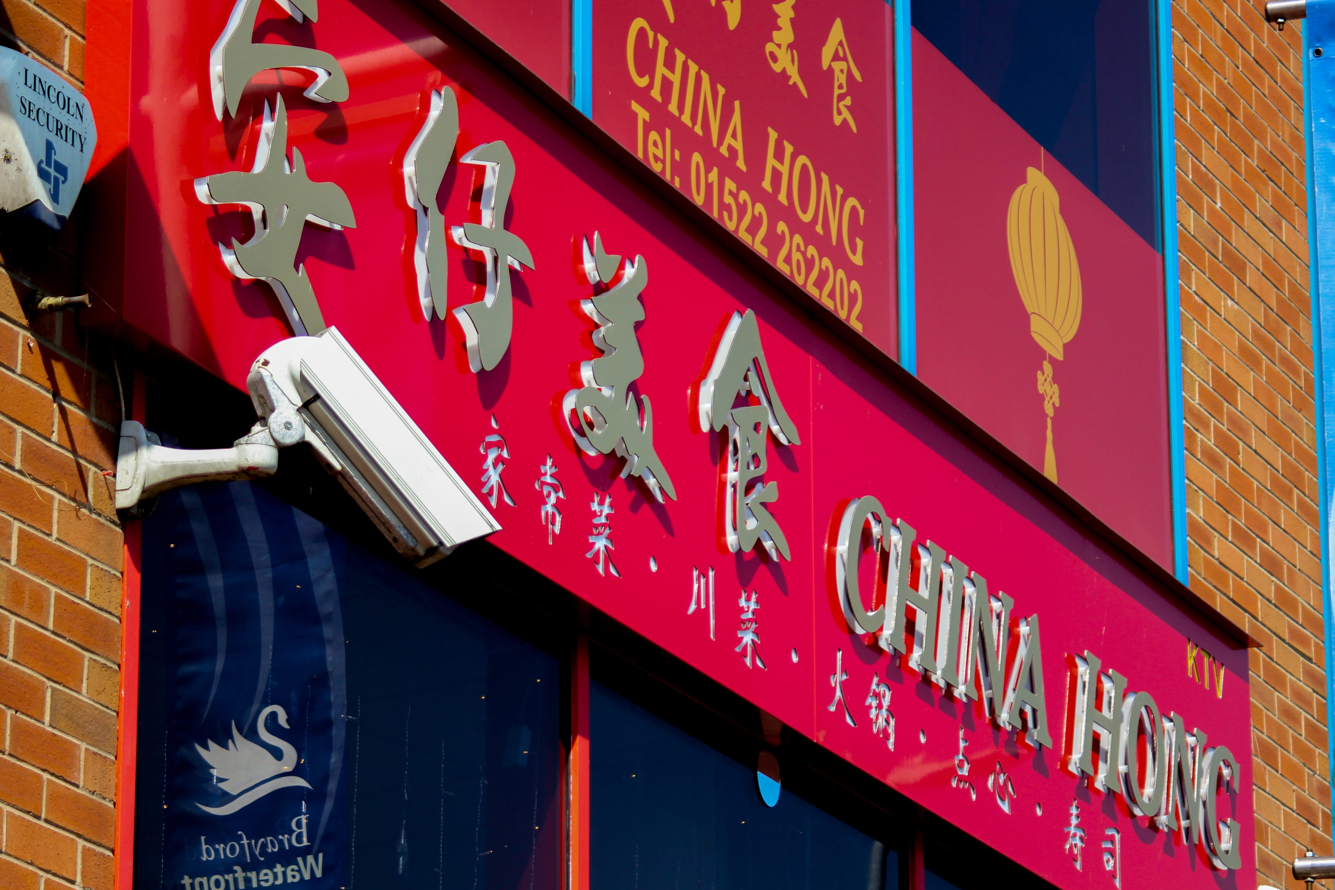
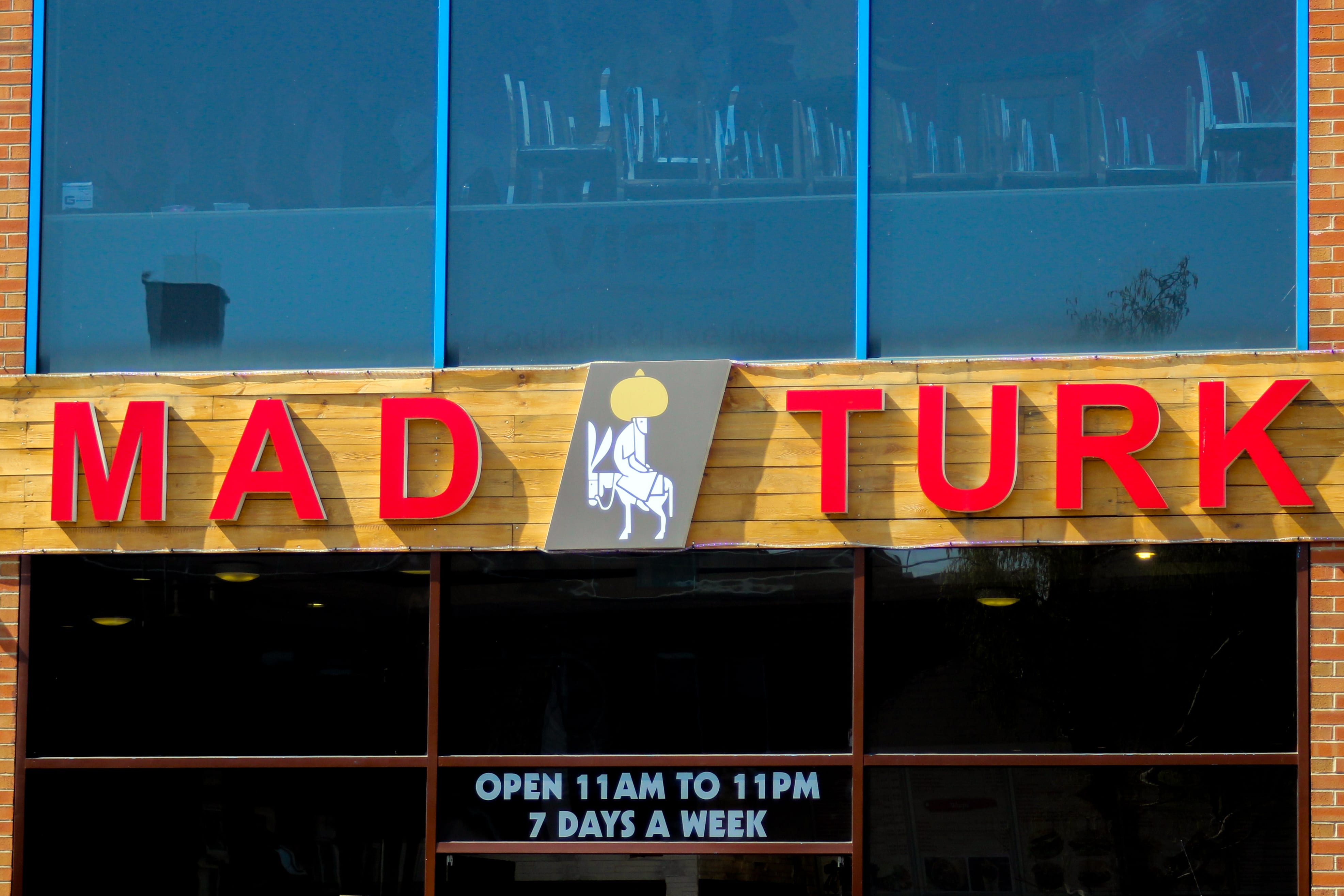
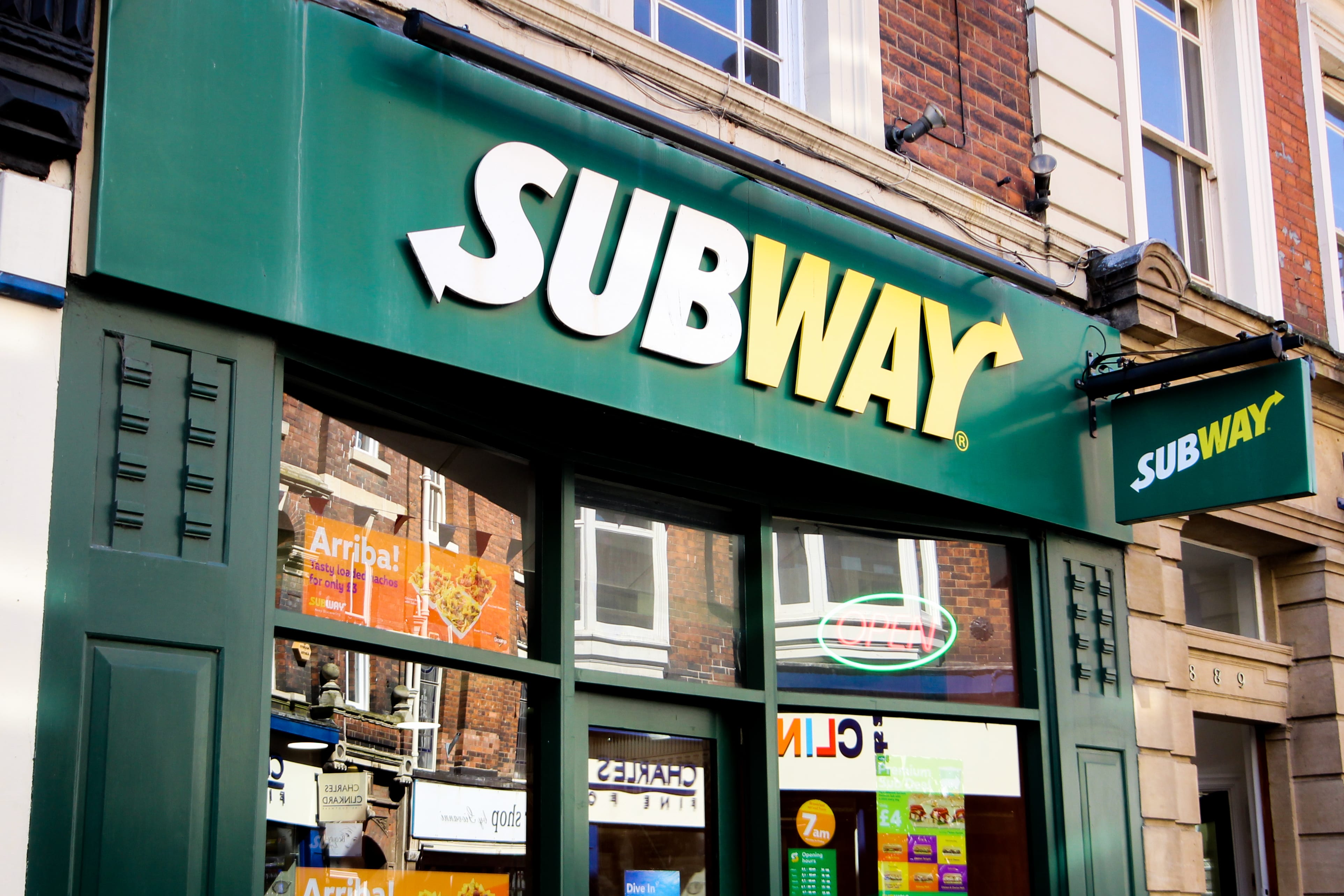
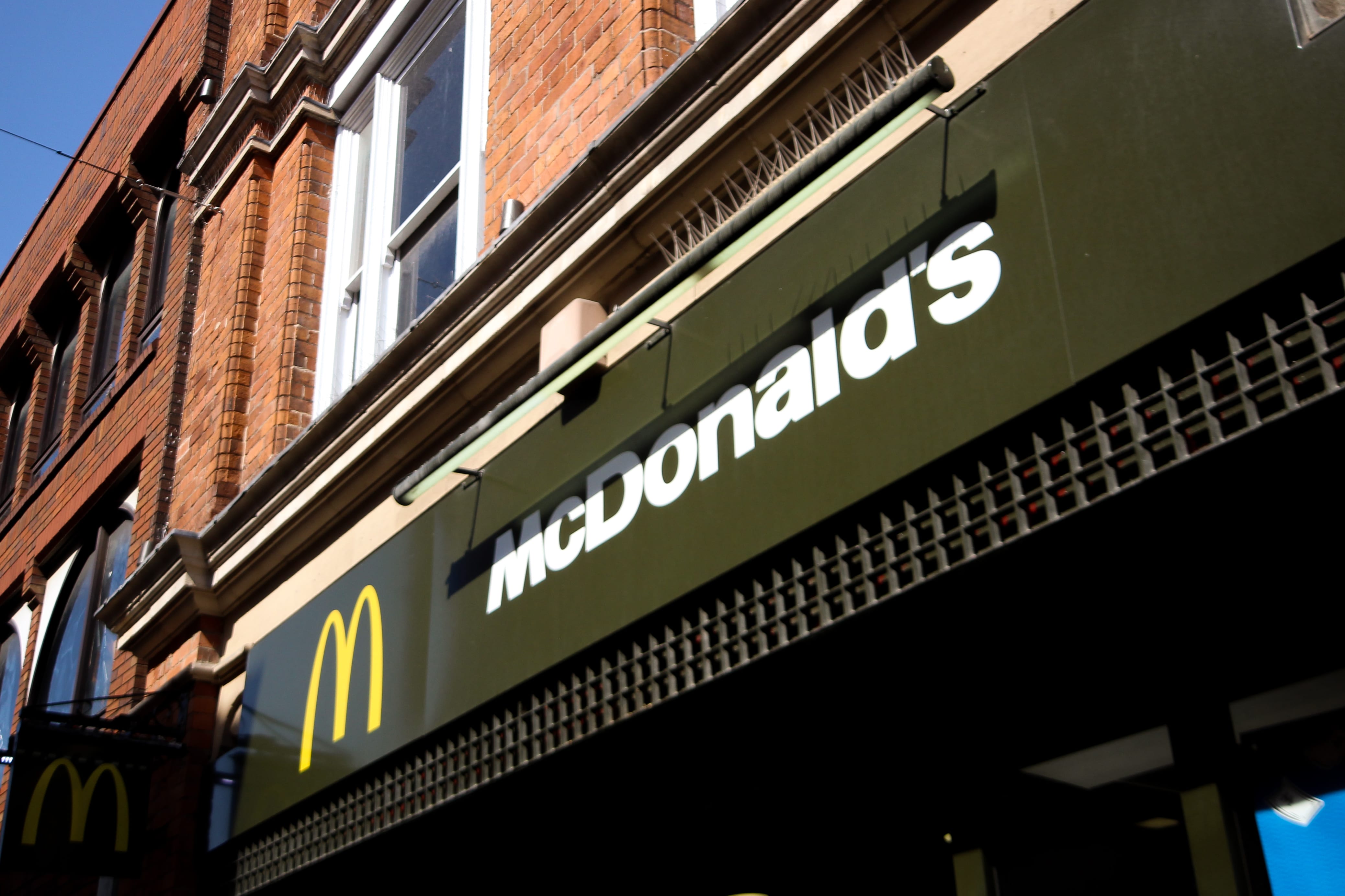
I set my images out in 2 sets of 3 so that I could look at 3 different cuisines on both sides. My first set of images was taken near the cinema, all 3 of the restaurants were on the stretch of road, which made me think about how global brands compare. As you can see through the images the 3 global brands are scattered throughout the city, this can also be seen in many towns and cities in Britain, this is in contrast to takeaways and foreign cuisines that are usually grouped together.
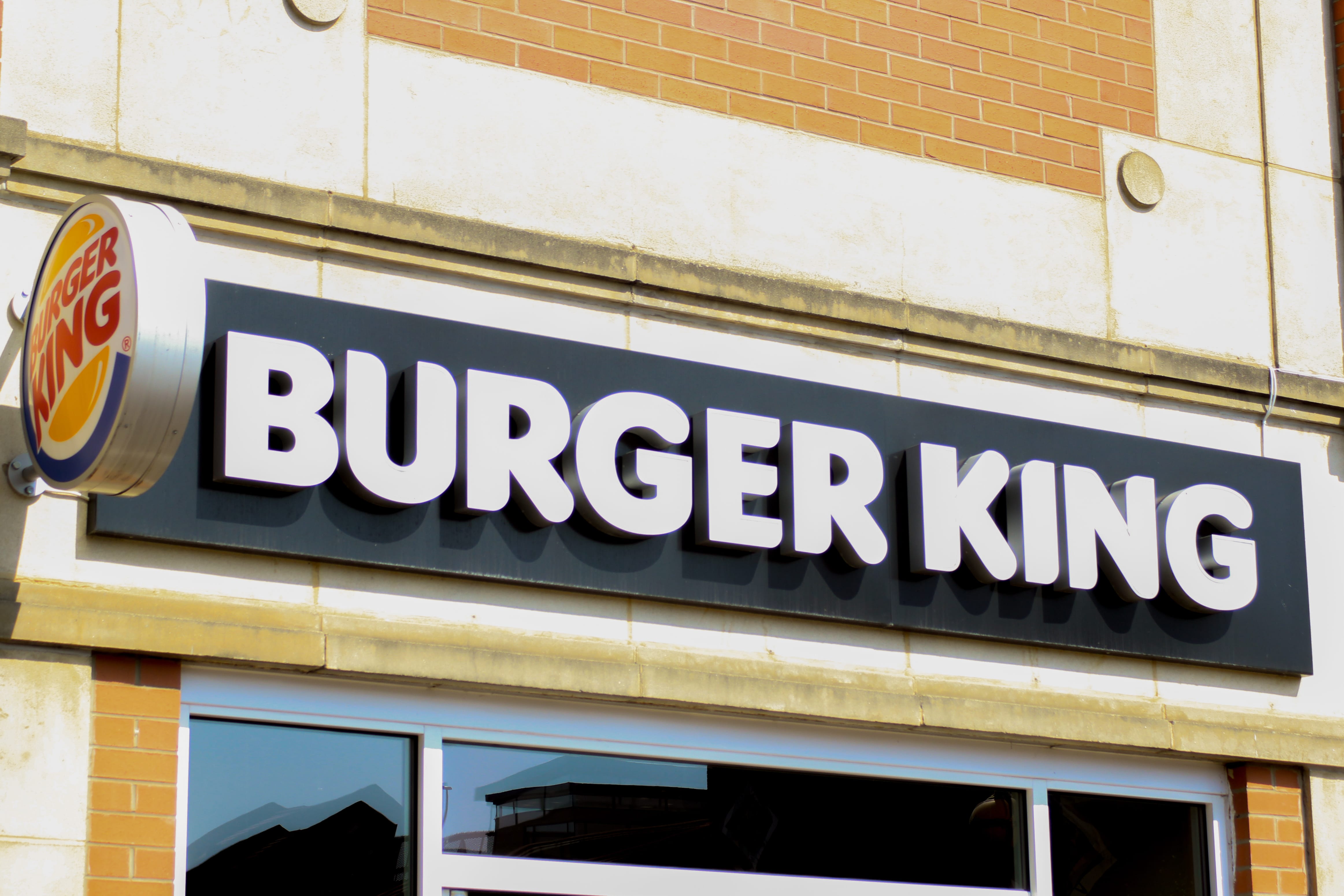
One thing I took from these restaurants is that they have to use the name of the country that the cuisine is based on in its name. Again this is most popular with takeaways and these types of establishments. I also found it interesting that they all come from eastern cultures, so we have Thai, Chinese and Turkish style restaurants which are locally based in Lincoln compared to the likes of Burger King, Subway and McDonalds which are all American brands. The globalisation being shown is that the bigger restaurants have more of a brand and can reach out to more people due to there high status, whereas local restaurants are only known in its particular area, however, they still have a sense of globalisation in the fact that they are not typical British eateries. Ever since the migration of South East Asians many restaurants have appeared all over creating a more diverse taste in our food culture which was not common until now.
Looking at these 3 establishments the colour palettes are somewhat similar. They use red and gold which is most common for these type of restaurants as it encapsulates the feeling of the cuisines it’s based on. It’s interesting to note that fast food chains use to have a similar style to these restaurants by using bold bright colours to draw peoples attention. “It’s likely that you have heard that the colour red makes people feel hungry. Well, it’s true. Research has suggested that appetites are sparked when we see the colour red or when we are in red places…” (The VCG, 2013). The name of the restaurants helps people know what they specialise in, compared to the mass where they already have established names that don’t feature a name of its origins or type of food it does.
As you can see these popular restaurants use a more subtle attempt at branding themselves by having a toned-down colour palette with black and dark greens as the backdrop and a bold white for the branding, yellow is also there to help complement the white over the darker colours. Something that I noticed was that the majority of brands like McDonald’s are changing a lot of their store colours to green. With this, you can almost see a different way in which it makes you feel towards it. Using green gives us as consumers a new way to look at the brand as it represents nature and can be seen as environmentally friendly. It can be seen as a shift in moods as it use to be bright and bold and was ‘fast food’, but now it’s more about having to enjoy yourself and feeling comfortable whilst you eat. I would like to think that they try to appear more grown up and showing they’ve evolved from their previous look, this is something that can be seen by all 3 brands. “It would be interesting to know if this has attracted a new ‘green’ customer base, one that is more environmentally aware…?” (Karen Haller, 2011), which ironically brings back my original concept of the images.
All the images were taken with the same lens 10mm-20mm, this was to keep a continuity of shots, but also being able to get a full image whilst maintaining full focus. In the editing process, I had to change the way the light was affecting the image. For the first 3 images, the light was already bright enough to work with all I had to do was tone down the exposure and mess with the contrast to give the colours more vibrant, whereas the last 3 images the natural light was hidden and so I had to increase the exposure. but at the same time maintain the shadows and highlights so it wouldn’t become overexposed.
In conclusion, I think that I could’ve pushed myself to get better images and maybe include more examples of globalisation, I could’ve also tried to go for my original idea and see how it would appear before changing, however, I believe that what I try to say about my images comes across, having done research into globalisation and the way in which certain brands can have such a huge effect on us mentally. I would like to say that I didn’t necessarily enjoy doing this work, but having now looked back it has somewhat given me a new perspective in viewing consumer brands and how it can be preserved.
Bibliography
The VCG, (2013) Red and Yellow Make Us Eat; How Restaurants Suck Us In [Article] Available from http://thevisualcommunicationguy.com/2013/10/13/red-and-yellow-how-restaurants-suck-us-in/ [Acessed March 16th, 2018]
Karen Haller, (2011) branding – why red & yellow is used by the fast food industry [Article] Available from http://karenhaller.co.uk/blog/branding-why-red-yellow-is-used-by-the-fast-food-industry/ [Acessed March 16th, 2018]